Inventory hierarchy
Separated items, memories and details and gave permanent progression a larger central area.
See the design details ↓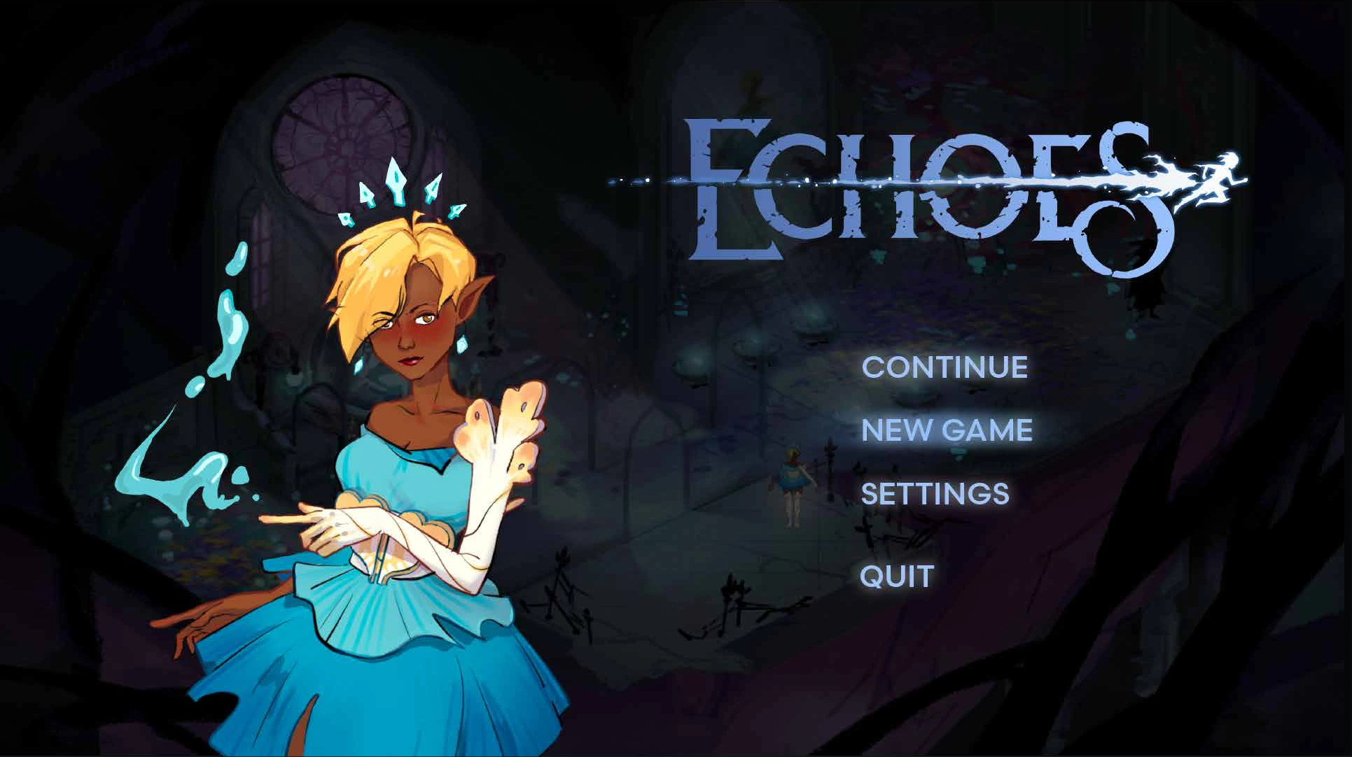 ← All projects
Isometric action roguelite
Hand-drawn interfaces for a fae world.
I designed a hand-drawn, skeuomorphic interface language for Echoes. Memories receive more visual weight than collected items, and ornament stays around the controls rather than competing with them.
Readable interfaces inside an intricate fae world.
Separated items, memories and details and gave permanent progression a larger central area.
See the design details ↓Developed settings from a control wireframe through an ornament-heavy draft to a clearer final frame.
See the design details ↓Used local highlights for journal selection and changing leaf fill/color for health states.
See the design details ↓01 / INVENTORY & MEMORIES
The inventory separates collected items at left, memories in the center and details at right. The larger central frame gives lasting progression more visual weight. In the wireframe, the selected object’s illustration and effect stay beside the grid; the final UI keeps that browsing structure within the fae-inspired frame.
02 / SETTINGS ITERATION
The three settings stages are shown left to right in development order. The wireframe establishes row spacing. In the first visual draft, dense branches crowd the labels and slider controls. The final frame shifts ornament to the perimeter, opens the center and uses brighter handles to mark adjustable values.
03 / JOURNAL BROWSING
The journal puts category switching above the list. A local warm highlight marks the active row, while the object illustration and description stay beside the selection. This gives players a visible browsing position as they change entries. The image here demonstrates selection feedback; health-state feedback is shown separately in the next section.
04 / HEALTH & VISUAL CUES
The health studies below show full, partial and empty leaf shapes. The changing fill supplements the pink glow, so the state is expressed through both shape and color. Cream floral curves and butterfly silhouettes connect the interface frames and icons to the game’s fae world.